
Typography enhances the readability of the written word, allowing the reader to navigate the flow of content. The ‘text’ is a stable body of ideas expressed in a fundamental form through which typography becomes key in visualizing language. A classic typographic page has great emphasis on the integrity and closure of a work, with each word being a distinct comprehensible unit. Typography manipulates the unintelligible proportions of the alphabet encompassing techniques which are seen but not heard, such as spacing and punctuation, into coherent substance. Spacing and punctuation becomes amalgamated from ‘gap and gesture’ to a physical form in order to give the text meaning. As Walter Ong stated:
‘Writing moves words from the sound world to the world of visual space, but print locks the words into position in this space.’
Lupton, E (2008) 'Thinking With Type'
Lupton, E (2008) 'Thinking With Type'
Writing is a visual manifestation of the spoken language which occupies space as well as time. There is an underlying emphasis of space over sequence and structure over linear narrative present within most design projects. It is this sophisticated use of space which has allowed typography to become a flexible system of attributes rather than a stable body of linear objects. This dramatization of space allows designers to gain an understanding of complex documentations.
Typography is ultimately a mode of interpretation with the dominant subject being the user rather than the reader or the writer; how the text is used becomes more important than what they mean. Users are provided with a degree of control and self direction due to them being increasingly challenged to deduce their own meanings from a piece of text. The integration of both form and content was key to Dada and Futurist poets; a reduced focus on a concrete layout within the page led to their systematic and global approach to the construction of the text. It was soon discovered that the empty space on a page can occupy equal presence to that of printed areas. Edward Tufte argues that a single surface filled with well organized information can often allow the reader to make connections and comparisons more easily than multiple pages containing blank space. However, this leads to the increased possibility of information overload, as any one person only has the ability to process one message at a time; thus giving the typographic interface competition for our attention. In the interface becoming more distinct, typography now illuminates the construction and identity of a piece of text. Marshall McLuhan puts all this into perspective in saying
‘Typography tended to alter language from a means of perspective and exploration to a portable commodity.’
Lupton, E (2008) 'Thinking With Type'
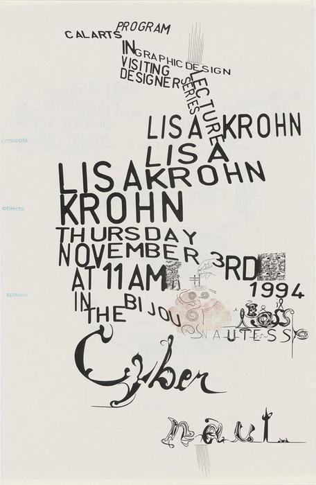
Edward Fella, (1994) 'Lisa Khron'
Control and regulation of space has always been the aim of typography, however, Fella treats these spaces in an elastic manor. He has truly broken the rules of layout within typography. In having no unified message or hierarchy of information, his posters are unstructured, inconsistent and irregular. Fella pushes this irregular form even further with the use of the distorted sans serif typeface; hand drawn adaptations, flouting of the baseline and variations in size force the reader to read the text rather than dismissing it. All these rule breaking mutations were Fella’s way of exploiting the glue that holds typography together; space.
No comments:
Post a Comment