Wednesday, 6 April 2011

Essay.

Focusing on specific examples, describe the way that Modernist art & design was a response to the forces of modernity.
Modernism expresses the cultural responses to the new condition of modernity. It has considerably shaped the built environment we live in today; the buildings we inhabit, chairs we sit on and graphic design we observe are all created by the aesthetics and ideologies of Modernist design. (Wilk, 2006) Modernity occurred alongside the processes of industrialisation and urbanisation; bringing about significant progressive changes between 1750-1950. Modernism amalgamates a wide array of movements; Cubism, Expressionism, Futurism, Dadaism, Serialism and Surrealism, and ideas; abstraction, functionalism, atonality, free verse. (Weston, 2001) Thus affecting an array of art practices; architecture, hand made objects, furniture and furnishings, dress, industrial, theatre and graphic design. Modern design is a notably formal innovation with a self-conscious motive to create something new and an inclination towards abstraction. (Wilk, 2006) 
The fundamental features of modernity aided the fabrication of modernist design; the city, communication, progression and rationality and reason. The city was key in providing a ground for the modern experience, especially in attracting those living in the countryside during industrialisation. Effective communications flourished with the emergence of rapid transport systems, rail and road, steamships and the telegraph; all of which promoted  change in society, predominantly through the ideology of mobility. There is a utopian ideal of progression inherent within the concept of modernity. Progress is the underlying notion of modernity, connoting change for the better in an attempt to improve lives. Lastly, the notion of rationality and reason made way for the concept that the only way in which this ideal can be achieved is through the immersion of a civilised state and the consequent rejection of religious systems of rule. Scientific progress and intellectual investigation are superior to that of religion resulting in secularisation with a decline in the role of the Church. These features are highly influential to the construction of modern design. As was suggested by Mies van der Rohe ‘we have science, we have technology, we have industrialisation. All are accepted as part of progressive existence, the question is how we guide them in a direction that is beneficial to all of us.’  (Weston, 2001, p201)

Walter Gropius, Bauhaus, Dessau, 1925-6. 


This German school is an architectural structure founded in 1919 in Weimar, as a college of design, before moving in 1925 to its spectacular purpose-designed building in Dessau, created by the architect Walter Gropius. The Bauhaus building quickly established itself as an icon of Classical Modernism; leaving a indelible mark on the rest of the design world which is still felt today. (Wallpaper*) Gropius was precise as to what form his architectural synthesis would take, wanting to create ‘a clear, organic architecture, whose inner logic will be radiant and naked.‘ He wanted this architectural phenomenon to be ‘adapted to our world of machines, radios and fast cars’ making use of ‘the increasing strength of materials- steel, concrete, glass.’ (Curtis, 1996, p194) The school symbolised the Modernist movement predominantly through it’s truth to materials, with prime importance being on design functionality. It espoused utopian ideals and was renowned as a temple of rationalism. (Weston, 2001) The school’s art education system combined art, design, architecture, and crafts into a unified whole. (Talk Talk) This functionalist approach was adopted by the world of design, thus resulting in the production of innovative work and forward-thinking designers; with some of the most revolutionary designs of the 20th century being a product of the Bauhaus, including buildings constructed from steel and glass, and tubular steel furniture. (Curtis, 1996) This use of steel and glass was due to the occurrence of industrialization. The aesthetics of this German college demonstrated the rejection of ornament during this period. It has a stripped down, neutral and modern appearance, which is an obvious attack on the decorative styles that attempt to tap into fashionable design. This rejection of decoration allows the building to remain minimalist; having the use of colour fully built-in the architectural solution. (Baumann, 2007) The Bauhaus style of architecture is an example of Internationalism; the clean-cut, unsupported corners, glass curtain walls and cubic blocks demonstrate their willingness to embrace new technologies in order to be recognisable to an international audience. (Curtis, 1996) Whilst at the same time, helping to create a sense of truth about the building, ensuring it is non-illusionary as not to form a false pretense. As noted by Jan Tschichold, ‘the final and most pure form of a necessary item is always constructed of geometric shapes.’ (Weston, 2001, p119) This German college of design is true to this statement and revolutionary to the modernist period that it was built in. 
Most of the furniture for the Bauhaus embodied Modernisms key values as much as architecture. The chair was an paradigmatic object type which achieved symbolic importance beyond it’s commercial success due to it’s ability to capture the imagination of so many contemporaries as a result of it’s progressive abstraction. It was a compact design problem that exerted a strong hold on the inter-war designers due to the lack of opportunity for architects to engage in architectural construction resulting from poor economic climate in Europe after the First World War. (Wilk, 2006) Architects applied themselves to seating design as it was cheaper and easier to manufacture a chair in comparison to a building and no commissioning client was required. The chair was also an essential element of daily life to all, thus giving them a chance of bringing attention to themselves through their interrogation, investigation and rethinking of the chair’s design; giving their results had a chance of being realised at least to the stage of photography and exhibition, if not manufacture and use. (Wilk, 2006)

Marcel Breuer, Club chair, 1925.

Marcel Breuer’s chairs demonstrated a new way of dwelling; the process of progressive abstraction, the shift from wood to metal and the gradual diminishing of the chair’s structure. (Wilk, 2006) Breuer’s designs were light and subsequently easy to move, neither displacing space or blocking views; they were visually transparent and minimalistic, allowing the interior space to remain open and free flowing. As Breuer stated ‘it neither impedes movement nor the view through the room.’ (Wilk, 2006, p229) His chair’s made use of the new technologies of chromed steel and newly developed textiles, resulting in a minimal use of materials without depleting the appearance. These metal cantilevered chairs were cheap, mass producible and easy to hand. This use of steel was, again, due to the materialization of industrialization alongside Modernity. Breuer’s logic of disappearance posed upon this chair design represents the free unfolding of modern life; it is not a timeless piece of design but instead expresses the history of the type. (Bergdoll, 2009) It is instantly recognisable as a chair as it’s form did not break with tradition, suggesting an abstraction not of loss but of plentitude. 
The establishment of the Bauhaus enabled graphic design to provide a way to communicate the modern world and reflect upon it.
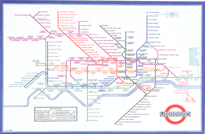
Harry Beck, London Underground Map, 1933.

The iconic London Underground map was produced by Beck, an engineering draughtsman, in 1933 and has been continually in use since. It is in fact a diagram of the network rather than a true geographical representation, showing relationships rather than distances. Beck argued that ‘if you’re going underground, why do you need to bother about geography? ...Connections are the thing.’ (V&A) The map uses horizontal, vertical and diagonal lines, with each of the Tubes lines coloured differently for ease. (V&A) It also uses a sans serif typeface; the rejection of the stylistic features allows the design to appear eternal. Beck proposed this radical new design of the Underground railway system without using conventional mapping systems as he had found it too big to present geographically. (patrciktaylor) It was at first viewed skeptically for it was too radical, however, after a successful trial the map was put into production. (Wilk, 2006) Beck’s schematically networked map soon became a vital element in the Underground transport system, as it was now seen to be modern, rational and efficient with the form following the function. This simplified map has since become a design classic and a true example of visual communication, thus demonstrating the importance of simplicity, economy and utility; all of which are key values advocated by Modernist design. The London Underground map has been used as the model for similar worldwide maps, with updated versions still being in use today. (Weston, 2001) This is due to it being a language of design that is recognised on a international level; providing an understanding between nations. Beck’s Underground map is most certainly a true representation of how modernist design began moving away from the realistic way of depicting the world and instead relying on signs and symbols. (20thCenturyLondon)
In conclusion, it is the accumulation of such Modernist designs that have shaped our design world. As Walter Gropius stated in 1913 ‘The new times demand their own expression. Exactly stamped form devoid of all accident, clear contrasts, the ordering of members, the arrangement of like parts in series, unity of form and colour...’ (Curtis, 1996, p183) Modernism has instigated a vocabulary of styles, made way for the production of the art and design education and brought about the ideology that form follows function. Significant changes took place during Modernism; effective communications were established, the city became the basis of the modern lifestyle, the notion of ‘change for the better’ was embraced and a civilised state replaced previous religious systems. All of this enabled Modernist design to embrace new technologies, function to be of prime importance, a rejection of historical references and recognition on an international level. As an art movement, Modernism fully embraced the concept of progression and has consequently had a notable influence on the design evident today. (Duncan, 1998)


1650 words


Bibliography
Books
Alastair Duncan (1998) Modernism: Modernist Design 1880-1940: The Norwest Collection, Norwest Collection, Norwest Corporation, Minneapolis. Antique Collectors’ Club.
Richard Weston (2001) Modernism. Phaidon Press.
Christopher Wilk (2006) Modernism: Designing a New World. Victoria and Albert Museum.
Stuart Hall, Bram Gieben (1992) Formations of Modernity
William J R Curtis (1996) Modern Architecture Since 1900. 3 Edition. Phaidon Press.
Kirsten Baumann (2007) Bauhaus Dessau, Architecture-Design-Concept. Jovis.
Barry Bergdoll (2009) Bauhaus 1919 1933. The Museum of Modern Art, New York
Malcolm Barnard (2005) Graphic design as communication. Routledge.

Websites
Talk Talk. Bauhaus. [Online]
Wallpaper*. The Bauhaus Building, Dessau [Online] (Updated 24 January 2011) Available at: http://www.wallpaper.com/architecture/the-bauhaus-building-dessau/3098 
[Accessed 29 December]
The Art Blog. 2003. Bauhaus Studies [Online] (Updated 24 January 2011)
Available at: http://theartblog.org/2010/03/bauhaus-studies/ [Accessed 28 December 2010]
Exploring 20th Century London. Beck, Henry (Harry). [Online] Available at:
[Accessed 29 December 2010]
Patrick Taylor. 2005. 1933 London Underground Map. [Online] Available at:
[Accessed 28 December 2010]
V&A. Modernism: Designing A New World 1914-1939. [Online] Available at:
[Accessed 29 December 2010]

Sunday, 20 February 2011

Deconstruction ...Task 5

Typography enhances the readability of the written word, allowing the reader to navigate the flow of content. The ‘text’ is a stable body of ideas expressed in a fundamental form through which typography becomes key in visualizing language. A classic typographic page has great emphasis on the integrity and closure of a work, with each word being a distinct comprehensible unit. Typography manipulates the unintelligible proportions of the alphabet encompassing techniques which are seen but not heard, such as spacing and punctuation, into coherent substance. Spacing and punctuation becomes amalgamated from ‘gap and gesture’ to a physical form in order to give the text meaning. As Walter Ong stated:
‘Writing moves words from the sound world to the world of visual space, but print locks the words into position in this space.’


Lupton, E (2008) 'Thinking With Type'
Writing is a visual manifestation of the spoken language which occupies space as well as time. There is an underlying emphasis of space over sequence and structure over linear narrative present within most design projects. It is this sophisticated use of space which has allowed typography to become a flexible system of attributes rather than a stable body of linear objects. This dramatization of space allows designers to gain an understanding of complex documentations. 
Typography is ultimately a mode of interpretation with the dominant subject being the user rather than the reader or the writer; how the text is used becomes more important than what they mean. Users are provided with a degree of control and self direction due to them being increasingly challenged to deduce their own meanings from a piece of text. The integration of both form and content was key to Dada and Futurist poets; a reduced focus on a concrete layout within the page led to their systematic and global approach to the construction of the text. It was soon discovered that the empty space on a page can occupy equal presence to that of printed areas. Edward Tufte argues that a single surface filled with well organized information can often allow the reader to make connections and comparisons more easily than multiple pages containing blank space. However, this leads to the increased possibility of information overload, as any one person only has the ability to process one message at a time; thus giving the typographic interface competition for our attention. In the interface becoming more distinct, typography now illuminates the construction and identity of a piece of text. Marshall McLuhan puts all this into perspective in saying
‘Typography tended to alter language from a means of perspective and exploration to a portable commodity.’ 


Lupton, E (2008) 'Thinking With Type'


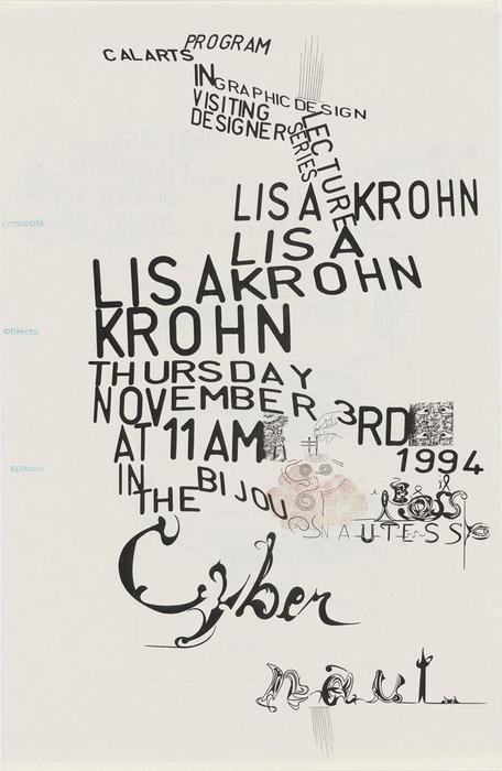
Control and regulation of space has always been the aim of typography, however, Fella treats these spaces in an elastic manor. He has truly broken the rules of layout within typography. In having no unified message or hierarchy of information, his posters are unstructured, inconsistent and irregular. Fella pushes this irregular form even further with the use of the distorted sans serif typeface; hand drawn adaptations, flouting of the baseline and variations in size force the reader to read the text rather than dismissing it. All these rule breaking mutations were Fella’s way of exploiting the glue that holds typography together; space. 

Friday, 18 February 2011

Postmodernism....Task 4

In art, Postmodernism was a reaction against modernism; a collapsing distinction between high culture and mass culture resulted in the refusal to recognise the authority of any given style. Postmodern design contains the following characteristics: 
  • Mix of high brow and populist 
  • A rejection of the rules laid down by modernism
  • A rejection of the values of art laid down by modernism
  • Attack on the relationship between artist and artwork
  • Questions conventions of the modern world
  • Multiplicity of styles and approaches
  • Space for new voices


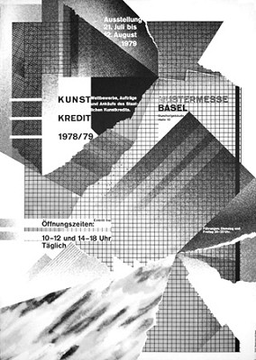
Wolfgang Weingart. (1979) 'Kunstkredit'

Weingart produced this poster to demonstrate that graphic design can be used to express artistic emotions. He created a 'self-referential graphic space' through his use of exposed grids, torn edges and random shapes.

Poynor, R. (2003) No More Rules: Graphic Design Postmodernism. London: Laurence King.


Dan Friedman. (1971) 'Typografische Monatsblatter'

Friedman has taken letters found in Times Square and floated them above the city. He has challenged the rules in his typographic layout by not following a structure. In his own words, it is 'simple, restrained, orderly, static, exclusive, abstract, pure, reduced, harmonious, systematic, and integrated.'

Poynor, R. (2003) No More Rules: Graphic Design Postmodernism. London: Laurence King.


Allen Hori (1989) 'Typography as Discourse'

The inconsistent irregularity of Hori's work forces the reader to the text rather than avoid it. There is no hierarchy of information so can be interpreted in a variety of ways, depending of the readers preference.


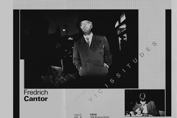
Willi Kunz (1978) 'Strange Vicissitudes'

Willi Kunz' poster promoting a photographic exhibition is a quintessential example of postmodern graphic design. He has simultaneously acknowledged and subverted the existence of the grid; the grid dots and slanted text are a hint of disturbance.


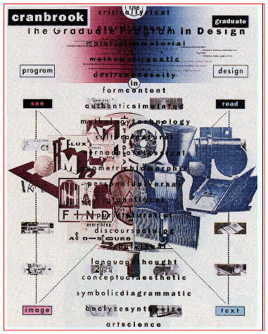
Katherine McCoy (1989) 'The Graduate Programme'

McCoy has used an array of Derridean opposites within this poster 'art/science', 'mythology/technology', 'purist/pluralist', 'vernacular/classical', all of which are structured around a centre spine. She has positioned this central column of text with no unified message over imagery making barely legible. 

Poynor, R. (2003) No More Rules: Graphic Design Postmodernism. London: Laurence King.

Tuesday, 15 February 2011

Deconstruction.

Find 5 examples&blog
Aims:
Text and typography in a critical way: function on typography in a meaningful way
Introduction to term: philisophy
show some design that has used model of practice
  • Dominant mode of gd in 80’s 90’s
  • the work they produced is a model for the integration of theory and practice together: a theory that is realised in practice, a practice that relies on theory.
  • approach that comes out of postmodernism
  • technique of post modern age: question unwritten assumptions, challenge and question conventions, set systems get replaced 
  • SEX PISTOLS COVER ....rejection: cohernce, anti-technique, no order, anti aesthetic- doesnt rely on colour theory: disrupting it, pluralism, a critique of the modern world, born out of frustration, cocky political form. 
  • deconstruction born out of desire to question
  • deconstruct-anaylse, read critically
  • deconstruction: a mode of questioning/differencing
  • deconstructivism: a style of practice, particularly associated with architecture
  • deconstructionism: interpreted in GD... not just simply reducing something to a simple idea or form (its an approach,a way of ananlysing) 
  • Cranbrook academy-deconstructionist was invented there
  • 6. a text: book, tv, fashion
  • look for hidden contradictions beneath
  • uncover systems that give meaning, how things are given a closed single meaning
  • form and content /speech&writing =opposites
  • get under surface of simple divisions, not two sides to some 100000000......
  • 7. often privaledge one over the other: spoken and written communication, spoken is privaledge: writing is the inferior copy to speech. 
  • the artwork is more important than the copy
  • language communicates speech
  • a book can speak eternally
  • the role of the spoken voice
  • writing is personified as gramatology 
What frames typography and writing: what influences content
read TEXT write 500 word summary on key functions of typography in communication, use key point to discuss one piece of deconstructionist GD.
  • content of book:ideas, knowledge
  • form: type&images: way idea communicated
  • crystal goblet: design is secondary to content 
  • vehicle for content or do they affect/create content: serif, cern, space, layout, 
  • some typography can have a voice but not others: depends on use
  • all typefaces have a voice....every book gives off a meaning before you look at it
  • novel... the words should speak for themselves
  • book with footnotes&no pics ...transmits message
  • form is not secondary to content....gives you a meaning
  • taking what seems to be givens 
Text
  • typography reads for you, stops the effort required 
  • paragraph spacing, sentences stop, one font 
  • standard ideas of reading avoid you reading
  • when you are reading its not you reading, its actually the type of designer reading for you
error and ownership
  • if somethings different, you read it more creatively, makes you question
  • if printed every page same: closes the work, giving only one meaning
  • gives on signify when it could give many
linearity
  • work and text: 
birth of the user:
  • importance of reader over writer
  • typography=mode of interpretation
  • not a crystal goblet-each typographic act is attempt to reframe the content
  • make choice to represent content in certain way
  • certain works insist on certain meaning
  • typographic styles and tactics to allow the user to interpret it in their own way (readerly text)
  • 10. taught conventions frame the way in which you read. looks like column when its actually not-one of the mechanisms that control meaning. through act of reading forced to think about meaning. exposing internal contradictions. have to jump gap when reading-makes you start to question how space affects meaning of work. have to read two way simultaneously=top to bottom ...left to right. instead of insisting one meaning, allows viewer to make discussions. both work together and separately. use typography to expose limitations. makes you look at form not just content. typography that is critiquing itself.
  • 11. people ca and should be readers, bringing their own interpreations to the table ...but dont.
  • post-structuralism=response
  • 15. reprinted book where structure slowly starts to dissolve. expect to see type and references. fragmented solid columns, irregular space, refernces dont connect, relation between reference and body disrupted ...makes you think about how controlled you are about normal typographic exposure. type not only had a voice, but controls. 
  • 18. advetise lecture. can start anywhere...no order. poster..order is normally controlled and you are led around it. liberated page. 
  • 19. template gothic typeface..even if structured in grid...defeats geometry. 
  • 20. explosion of gd insanity. overwhelms..makes you feel lost. stylistic. no order...page is largly blank,mainly going on in margins. RAY GUN.
  • deconstruction became a style. 
  • using type to explain an critique (of david carcism) 
deconstruction- a method not a style (paradoxically become a style)
works within a system to expose contradictions/limitations of system 
form is speaking more or as much as content, that is always the case even in a book.

Monday, 7 February 2011

Avant-Garde.

Avant-garde
In art, avant-garde refers to that which is innovatory; introducing and exploring new forms of design. The term avant-garde is almost synonymous with the modern. 


United Colours of Benetton most certainly produces graphic design which is at the forefront of avant-gardism. As a clothing company they communicate ideas and values in the most visually compelling way possible. The forward-looking nature of their work most certainly brings about the ‘shock factor’. Graphic design is witnessed as part of our everyday lives on a subconscious level, it is only the design that is visually arresting yet intellectually contesting that has the ability to grab the audiences’ attention. United Colours of Benetton entraps this attention through a bold direct manor via the use of their visual ambiguity, as seen with the real hearts in this race discrimination advertisement. It is a company that strives to ‘create “value” by capitalizing on an image’ most definitely adhering to the ‘Evolutionist’ concept of avant-gardism; progressing towards correcting the problems of the world. The reaction to these real-life photos was extreme, with many countries refusing to print the campaign. In eliminating any reference to the product in the design, it has successfully challenged the classic advertising strategies; a fine example of avant-garde.


Cover for the Sex Pistols'"God Save the Queen" single. Jamie Reid, 1977
The avant-garde ideology justifies the role of the artist and the manor in which they may operate. Due to the use of a defaced image of Queen Elizabeth II on this album  artwork for the Sex Pistols, it suggests the music if going to be reckless and experimental as it is the offence of Contempt of the Sovereign to deface an image of royalty.  This was artistic innovation of it’s time, pushing the boundaries and disregarding conventional styles in order to produce a piece of ‘cutting edge’ design to promote their music. It truly ignores the traditional ideals of art becoming a novelty piece of avant-gardism; seeking to be aesthetically innovative not concerned with the politics of the world. 
[Image 2]
[Accessed 7 Feb 2011]
[Image 1]
United Colour Of Benneton. UCB advertising presentation [online] (Updated 26 Oct 2009) Available at: http://press.benettongroup.com/ben_en/about/campaigns/history/ [Accessed 7 Feb 2011]